Sunday, March 9, 2008

Why are Mirrors one of my Favorite Things?

Dining Room Before:


Dining Room With Mirrors!


Since Louis XIV revolutionized mirror production in the late 17th century, mirrors have been synonymous with luxury and glamour.

Designers love mirrors because they multiply space and create views like magic.

This is my design for a custom wall mirror. This is proposed for a client's dining room and will reflect a spectacular view of the Puget Sound. The mirror will be antiqued, accented with medallions at the corners, then framed in gold leafing with carved Neoclassical details.


The artwork is hung by custom sewn ribbons. The paintings are a charming pair that were purchased years ago when my clients were newlyweds. We brought them out of storage, framed them, and they have provided the inspiration for this room. So glamorous!


This is going to be spectacular, stay tuned...


Sunday, December 30, 2007

Who Was David Hicks?


I fell in love with this late British designer in the early 90's by reading all his old books from the 60's and 70's which I found at the public library. What was it that attracted me so? It was the clean, the graphic, the eclectic, and the glamorous. It's what is happening in design right now. David Hicks has been hugely influential lately.
His later designs from the 80's don't look quite as interesting right now, but they still show the strong sense of symmetry, repetition, and eclectisism that made his earlier more glamorous work look so good.
Here are some David Hicks trademarks which you will see all over fashionable rooms right now:
  • Geometric Patterns: He designed textiles, wallpapers, and carpets. His geometric designs are being reproduced in a big way. Pattern on the wall is a growing trend and especially patern underfoot.
  • Mixing Traditional and Modern: For example his rooms often juxtaposed boxy modern upholstered pieces with 18th century french chair shapes painted white with solid upholstery. Or a collection of antique decorative pieces featured on a simple parsons table.
  • Lucite: coffee tables, end tables, and always putting antique artifacts or sculptures under a lucite box, museum style.
  • Strong Colors: supported by a lot of white, and sometimes black accents (we could learn a lot about odd, bracing color combinations from the British designers. Why do we always want things to harmonize in such a "nice" way?)
  • Borders: plain borders framing pillows, sofas, beds, walls, rugs or roman shades.

Check out: http://www.dh1970.com/ for an archive of his designs.


How to be Trendy...or Not

(photo: NYTimes)


Here's a link to a year-end round up of decorating trends that are "over"!

http://www.nytimes.com/2007/12/20/garden/20over.html

If you're like me you may have been wondering:"what's up with all the antlers, faux deer heads, and woodland creatures popping up everywhere in the past few years?" (have you seen Smith, on 15th in Seattle?, they really went for it with the antlers)

The linked article has the answer.

As for the "Hollywood Regency" look being over, when a term becomes a keyword on Craigslist and Ebay descriptions to be lumped together with a bunch of other vague labels like "Eames", and when the pieces featured only vaguely have anything to do with the look. You know the trend is becoming threadbare.

The sad thing is how fast this is happening.

Neoclassical, yes, Empire, yes, but this chair would have to be more exaggerated to be "Hollywood Regency", maybe if it was laquered green with black and white zebra upholstery!


Also "Hollywood Regency" according to the lister on Craigslist. To me it's just a nice little mahogany dining chair with a neoclassical influence, probably from the 40's when this sort of thing was very common.

It could be pushed into "Hollywood Regency" territory if it were re-done, let's say white laquer with a bold, large scale black and white geometric seat fabric, that would do it!


Here is a room by Johnathan Adler which shows the exaggerated, almost cartoonish quality of the "Hollywood Regency" look. (and there's that zebra rug!)


Tuesday, November 6, 2007

A New Painting

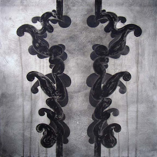
A small 8"x8" painting on board from Sunday. A little different direction. I'm so pleased that I would like to make a series of these.

I was obviously influenced by the monochrome and the use of graphite in Juan Alonso's paintings described below.

Monday, October 29, 2007

New Show by Juan Alonso

"The Big Bang"Juan Alonso, 2007ink, graphite / Claybord, unframed: 30 x 30"

I went to see Juan Alonso's new show at Francine Seders Gallery yesterday. The paintings are beautiful. All monochrome graphite and ink with subtly worked backgrounds and tone on tone black. In person you can see the sheen of the solid graphite shapes next to the dullness of the ink-washed shapes. There are lovely calligraphic markings in the background too, which repeat as if they are trying to find the final shapes.

I met Juan when I was in the Washington Artist Trust EDGE professional development program. He was a teacher for part of the program and was particularly inspiring because he has made a successful career as an artist without the benefit of art school.

The show will be up through Nov. 25th.

Thursday, October 11, 2007

Lois Graham Tribute

What I didn't know when I wrote my last post is that Lois was in the hospital. She passed away Tuesday morning, the 9th.

To what I wrote about her, and her artwork, and how she inspired me, I will add that she battled severe health problems for many years. She had debilitating rheumatoid arthritis that was disintegrtating every joint in her body. She had operation after operation, and it was a miracle that she could stand, let alone walk, let alone work so hard at making paintings.

Her immune system was so delicate that it was an infection, minor to most of us, that began the cascade of her organs being finally overwhelmed.

She painted in a large studio two floors above me. Knowing that she was up there every day, and possibly late at night, obsessively making her marks on a canvas, and knowing that she had been doing this for thirty years seemed to me to give a soul and moral direction to this building where several other artists live and/or work.

Several summers ago when I was on the roof garden learning to paint, she stopped to demonstrate a brushstroke. I had been used to making strokes on whole walls and rooms. She showed me how to slow down, and scale down, very small. How to make minute, very soft brustrokes in the oil paint that created a shimmering blended surface. It was a Zen like focus, paying incredible attention to small, small things, that startled me and showed me an intensity that I will always remember and try to emulate.

Thank you to Lois for being passionate and serious about making art.

See http://www.fosterwhite.com for more information.

Monday, October 8, 2007

Shimmering Dazzling Paintings by Lois Graham

Flux 2007 oil on canvas 32 x 72 in.


Recess 2007 oil on canvas 24 x 24 in.


Twist Stitch 2007 oil on canvas 24 x 48 in.


My neighbor, painter Lois Graham is showing at Foster White Gallery in Seattle. The opening was this past thursday night. These paintings are a concentrated distillation of what she has been doing for many years.

The show is beautiful. The surfaces of the paintings seem to shimmer and dance with points of contrasting colors. I couldn't focus my eyes on the center of "Recess". It's as if they have a sound: a low intense humming vibration.

She is truly an inspiration, at work constantly. Her way of life is painting in her studio. http://www.fosterwhite.com/